ggplot2 Quick Reference
Our research often involves quantitative studies producing large amounts of data. To analyze and visualize that data we use various tools (and we sometimes develop our own, such as Trevis or LagAlyzer). One of the most effective general information visualization tools we know is Hadley Wickham's ggplot2 package for R.
Our pages here provide a quick reference, mostly for our own use. We made them public because we think others might benefit from them, too.
This quick reference is based on ggplot2 version 0.8.8 running on R version 2.11.1.
A Presentation Introducing ggplot2
You may want to look at the slides of the lecture on ggplot2 we usually give in our Software Performance course at the University of Lugano.
You also may want to check out the presentations on the basics of R and on Descriptive Statistics and Visualization (with R) in the same course.
The Anatomy of a Plot
 +
+ +
+") =
=
In ggplot2, you create a plot using the ggplot() function. A plot can contain an arbitrary number of layers. You can create a layer with the general layer() function, or you can use one of many specialized functions that invoke layer() for you (such as geom_point()) to produce various kinds of layers.
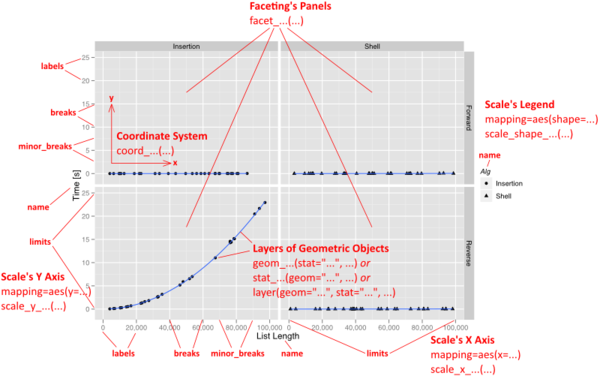
Besides a list of layers, a plot also has a coordinate system, scales, and a faceting specification. These three aspects are shared among all layers in the plot. The visual properties of these aspects are specified by a theme.
Each layer uses a specific kind of statistic to summarize data, draws a specific kind of geometric object (geom) for each of the (statistically aggregated) data items, and uses a specific kind of position adjustment to deal with geoms that might visually obstruct each other.
The Grammar of Graphics
ggplot2 implements the idea of a "grammar of graphics". The grammar implemented by ggplot2 could be summarized as follows:
plot ::= coord scale+ facet? layer+
layer ::= data mapping stat geom position?
A plot is defined by a coordinate system (coord), one or more scales (scale), an optional faceting specification (facet), and one or more layers (layer). A layer is defined as an R data frame (data), a specification mapping columns of that frame into aesthetic properties (mapping), a statistical approach to summarize the rows of that frame (stat), a geometric object to visually represent that summary (geom), and an optional position adjustment to move overlapping geometric objects out of their way (position).
Example
Before using ggplot2, you have to install and start R, install the "ggplot2" package, and then load ggplot2 as follows:
require(ggplot2)
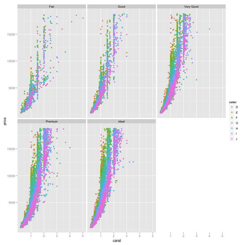
The following R command produces a plot with a single layer. The plot uses a cartesian coordinate system (coord_cartesian()). The x and y axes have a continuous scale (scale_x_continuous() + scale_y_continuous()). The color aesthetic is determined using a discrete hue color scale (scale_color_hue()). The plot is faceted, with one panel per level of the "cut" data attribute (a factor) and panels being wrapped into a grid of panels (facet_wrap(~cut)).
The layer represents data from the diamonds data frame (data=diamonds; each row of that data frame contains information about a diamond), which is a built-in example data frame of ggplot2. The layer uses the identity statistical transformation (stat="identity"; which does nothing). Thus, each individual diamond is represented using a geometric object. The object chosen is a point (geom="point"). The attributes of a diamond are mapped into the aesthetic properties of the geometric object (with mapping=aes(...)) as follows: the "carat" attribute is mapped to the x coordinate (x=carat), the "price" attribute is mapped into the y coordinate (y=price), the "color" attribute is mapped into the color of the geometric point (color=color). Because the data frame contains over 53940 diamonds, there will be over 53940 geometric points. In a (rather unsuccessful) attempt to avoid over-plotting, we thus jitter the geometric points slightly (position=position_jitter()).
ggplot() +
coord_cartesian() +
scale_x_continuous() +
scale_y_continuous() +
scale_color_hue() +
facet_wrap(~cut) +
layer(
  data=diamonds,
  mapping=aes(x=carat, y=price, color=color),
  stat="identity",
  stat_params=list(),
  geom="point",
  geom_params=list(),
  position=position_jitter()
)
The resulting plot looks as follows:
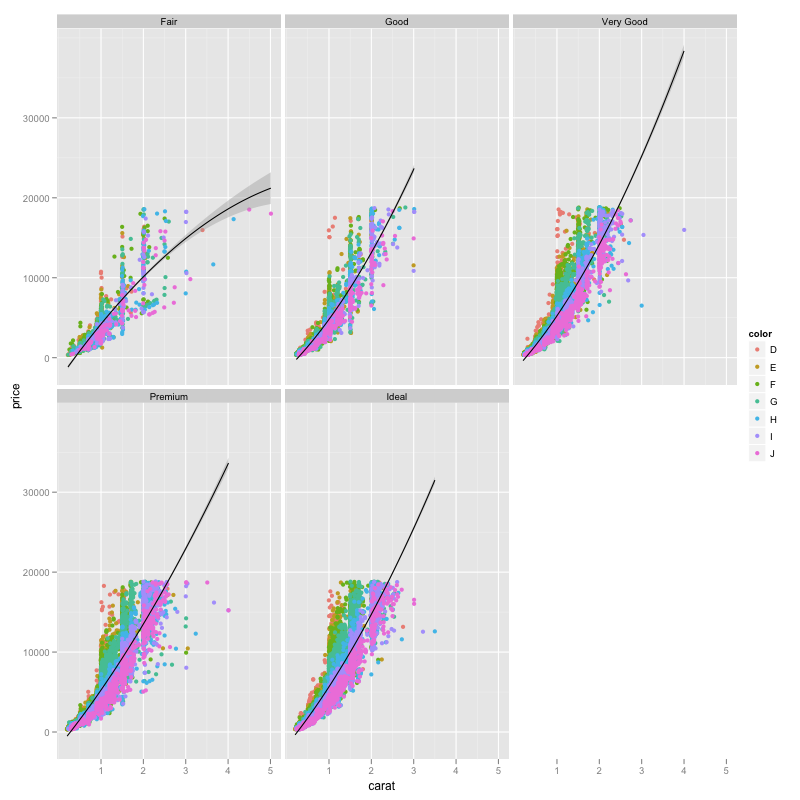
We can easily add another layer to this plot. Here, the configuration of the plot and the first layer is identical to the above example. The second layer uses the smooth statistic (stat="smooth") and the smoother geometric object (geom="smooth"). It configures that statistic to fit a quadratic function through the data (stat_params=list(method="glm", formula=y~poly(x,2))). It configures the geometric object to use a black line color (geom_params=list(color="black"); instead of the default blue). The position of the smoother is left unchanged (position=position_identity()).
ggplot() +
coord_cartesian() +
scale_x_continuous() +
scale_y_continuous() +
scale_color_hue() +
facet_wrap(~cut) +
layer(
  data=diamonds,
  mapping=aes(x=carat, y=price, color=color),
  stat="identity",
  stat_params=list(),
  geom="point",
  geom_params=list(),
  position=position_jitter()
) +
layer(
  data=diamonds,
  mapping=aes(x=carat,y=price),
  stat="smooth",
  stat_params=list(method="glm", formula=y~poly(x,2)),
  geom="smooth",
  geom_params=list(color="black"),
  position=position_identity()
)
The resulting plot looks as follows:
Verbosity of Plot Specifications
The above code is relatively verbose. ggplot2 provides various approaches to allow for more concise specifications of plots. Those shortcuts are helpful for experts to save time in defining plots, and they can allow even a novice to create a plot without fully understanding ggplot2. However, using mostly these shortcuts in this quick reference would not be very helpful for understanding the space of possible plots that ggplot2 can create. Nevertheless, we do provide a discussion of how to write more concise plot specifications.
Publication Highlights
OOPSLA'15 - Use at Own Risk
PPPJ'13 - Jikes RVM Debugger
PLDI'12 - Algorithmic Profiling
OOPSLA'11 - Catch Me
ECOOP'11 - Beauty and Beast
PLDI'10 - Profiler (In)Accuracy
ASPLOS'09 - Measurement Bias
More...
Blast
Our framework for bytecode-level information-flow tracing of Java programs.
Jikes RDB
Working with the Jikes RVM? Use Jikes RDB for debugging your VM hacks.

Now built on top of LLDB, so it works on OS X and on Linux.