ggplot2 Quick Reference: geom_errorbarh
A geom that draws horizontal error bars, defined by an upper and lower value. This is useful e.g., to draw confidence intervals.
Default statistic: stat_identity
Default position adjustment: position_identity
Parameters
- y - (required) y coordinate of the bar
- xmin - (required) x coordinate of the lower whisker
- xmax - (required) x coordinate of the upper whisker
- x - (required) apparently unused (but required) x coordinate (maybe the center of the bar?)
- size - (default: 0.5) thickness of the lines
- linetype - (default: 1=solid) the type of the lines
- colour - (default: "black") the color of the lines
- height - (default: 0.9) height of the whiskers
- alpha - (default: 1=opaque) the transparency of the lines
Example
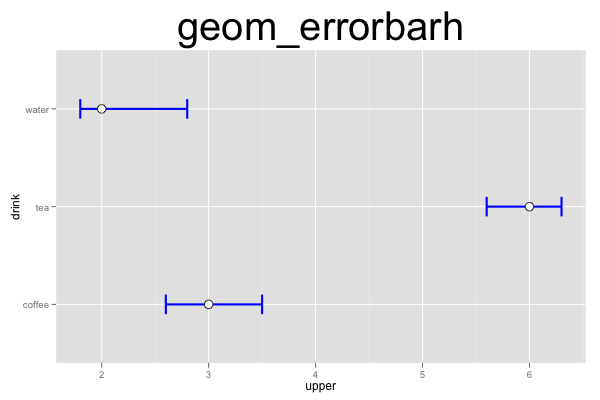
This plot consists of two layers. The bottom layer shows error bars, and the top layer shows points. Note that we have to provide (or compute) the ymin and ymax values for the error bars ourselves (the errorbarh geom does not automatically compute a confidence interval).

d=data.frame(drink=c("coffee","tea","water"), mean=c(3,6,2), lower=c(2.6,5.6,1.8), upper=c(3.5,6.3,2.8))
ggplot() +
geom_errorbarh(data=d, mapping=aes(y=drink, x=upper, xmin=upper, xmax=lower), height=0.2, size=1, color="blue") +
geom_point(data=d, mapping=aes(y=drink, x=mean), size=4, shape=21, fill="white") +
opts(title="geom_errorbarh", plot.title=theme_text(size=40, vjust=1.5))


