ggplot2 Quick Reference: geom_pointrange
A geom that draws point ranges, defined by an upper and lower value for the line, and a value for the point. This is useful e.g., to draw confidence intervals and the mean in one go.
A point range is similar to a linerange (plus the point). It is also similar to an errorbar (minus the whiskers, plus the point).
Default statistic: stat_identity
Default position adjustment: position_identity
Parameters
- x - (required) x coordinate of the line
- y - (required) y coordinate of the point
- ymin - (required) y coordinate of the lower end of the line
- ymax - (required) y coordinate of the upper end of the line
- size - (default: 0.5) thickness of the lines
- linetype - (default: 1=solid) the type of the lines
- shape - (default: 16=dot) the shape of the point
- colour - (default: "black") the color of the line and the point outline
- fill - (default: NA) the fill of the point (only a small minority of shapes actually can be filled; see shape)
- width - (default: 0.9) width of the whiskers
- alpha - (default: 1=opaque) the transparency of the lines
Example
This plot consists of a single layer showing point ranges. Note that we have to provide (or compute) the ymin and ymax values for the point ranges ourselves (the pointrange geom does not automatically compute e.g., a confidence interval).
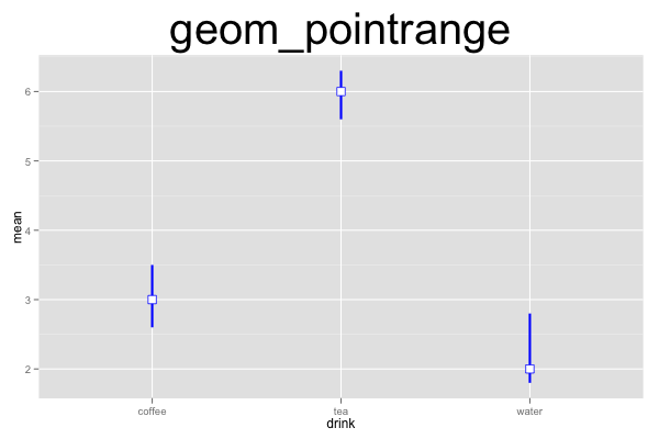
d=data.frame(drink=c("coffee","tea","water"), mean=c(3,6,2), lower=c(2.6,5.6,1.8), upper=c(3.5,6.3,2.8))
ggplot() +
geom_pointrange(data=d, mapping=aes(x=drink, y=mean, ymin=upper, ymax=lower), width=0.2, size=1, color="blue", fill="white", shape=22) +
opts(title="geom_pointrange", plot.title=theme_text(size=40, vjust=1.5))
Publication Highlights
OOPSLA'15 - Use at Own Risk
PPPJ'13 - Jikes RVM Debugger
PLDI'12 - Algorithmic Profiling
OOPSLA'11 - Catch Me
ECOOP'11 - Beauty and Beast
PLDI'10 - Profiler (In)Accuracy
ASPLOS'09 - Measurement Bias
More...
Blast
Our framework for bytecode-level information-flow tracing of Java programs.

Jikes RDB
Working with the Jikes RVM? Use Jikes RDB for debugging your VM hacks.

Now built on top of LLDB, so it works on OS X and on Linux.